Neutral Bedroom Paint Colors

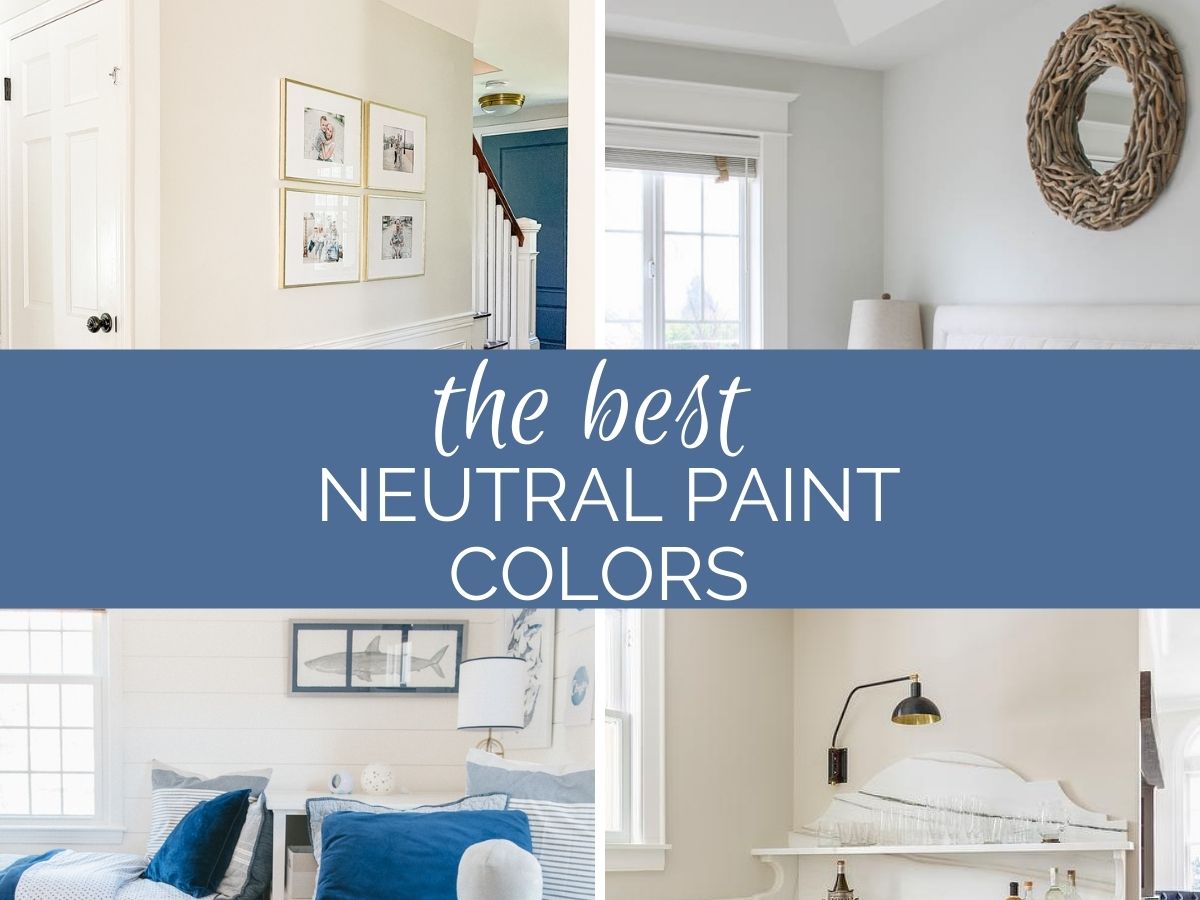
Paint your walls a neutral color scheme and you'll have the perfect palette for decorating. Here are the most popular neutral paint colors for your home in 2021.
Why Neutrals Are A Still Popular Choice
For 2021 neutral paint color trends we are seeing less of the cool grays of the past, and more warmth bring brought into interior spaces thanks to warmer grays and greige paint colors, creamy whites and even shades closer to beige.
As far as paint colors go, neutral colors remain the most popular paint colors for interiors in 2021. The neutral color palette of greige, beige and grey is a great choice when you want to create an interior with a clean, modern feel.
These paint colors can also work well in both traditional and contemporary settings!
Warm Gray and Greige
Gray has been a popular color for neutrals for close to a decade. This year, many homeowners and designers have started leaning into warmer grays and shades of greige. The warm neutrals create a soft, neutral tone, without the coldness associated with traditional gray.
These shades of paint can be used in any room without overwhelming or competing with the other colors or design elements of your space, making them the perfect neutral backdrop for your decor.
Popular Shades of Warm Gray and Greige
Repose Gray by Sherwin Williams
Repose Gray is one of the best selling paint colors for interiors. I've used it throughout my own home and absolutely love it.
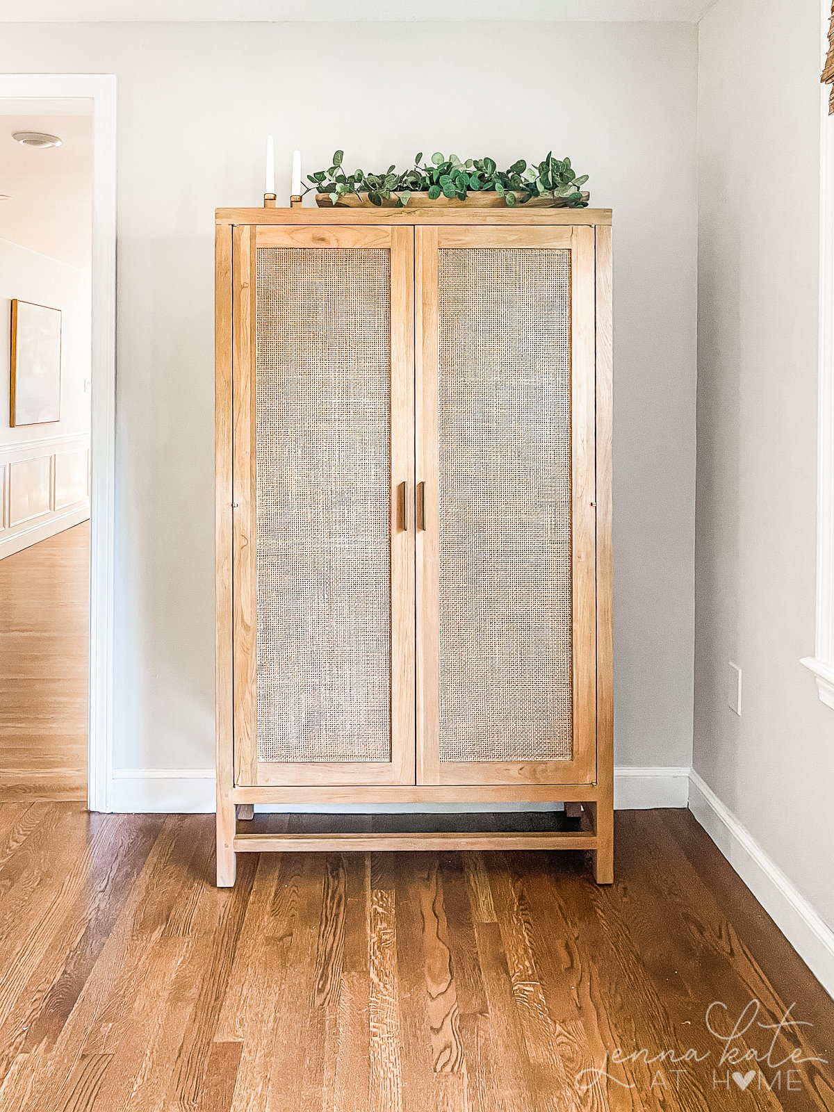
Repose Gray is a warm gray that has a slight green and purple undertone. But don't let that scare you away! Those colors simply add just the right amount of warmth to ensure it never feels like a cold gray.
I regularly have Repose Gray lightened by 50% at my local store, and love how light and airy the lighter version is.
Repose Gray is one of the most popular whole-house colors in recent years.
Crushed Ice by Sherwin Williams
This is a beautiful greige that works well in transitional spaces with a good amount of light. Despite its name, it does not have an icy appearance.
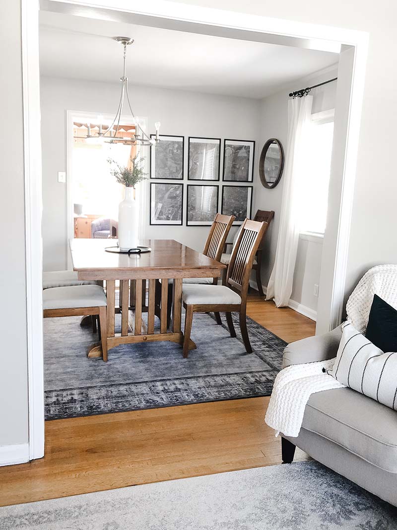
In fact, its quite warm and can even skew a touch pink. It's lighter than Repose Gray, but has more saturation of color. It was another contender for my kitchen remodel, but ended up being just a little too warm for what I wanted.
Agreeable Gray by Sherwin Williams
Another incredibly popular neutral paint color from Sherwin Williams. Agreeable Gray is considerably warmer than Repose Gray, firmly leaning more into the "greige" category.
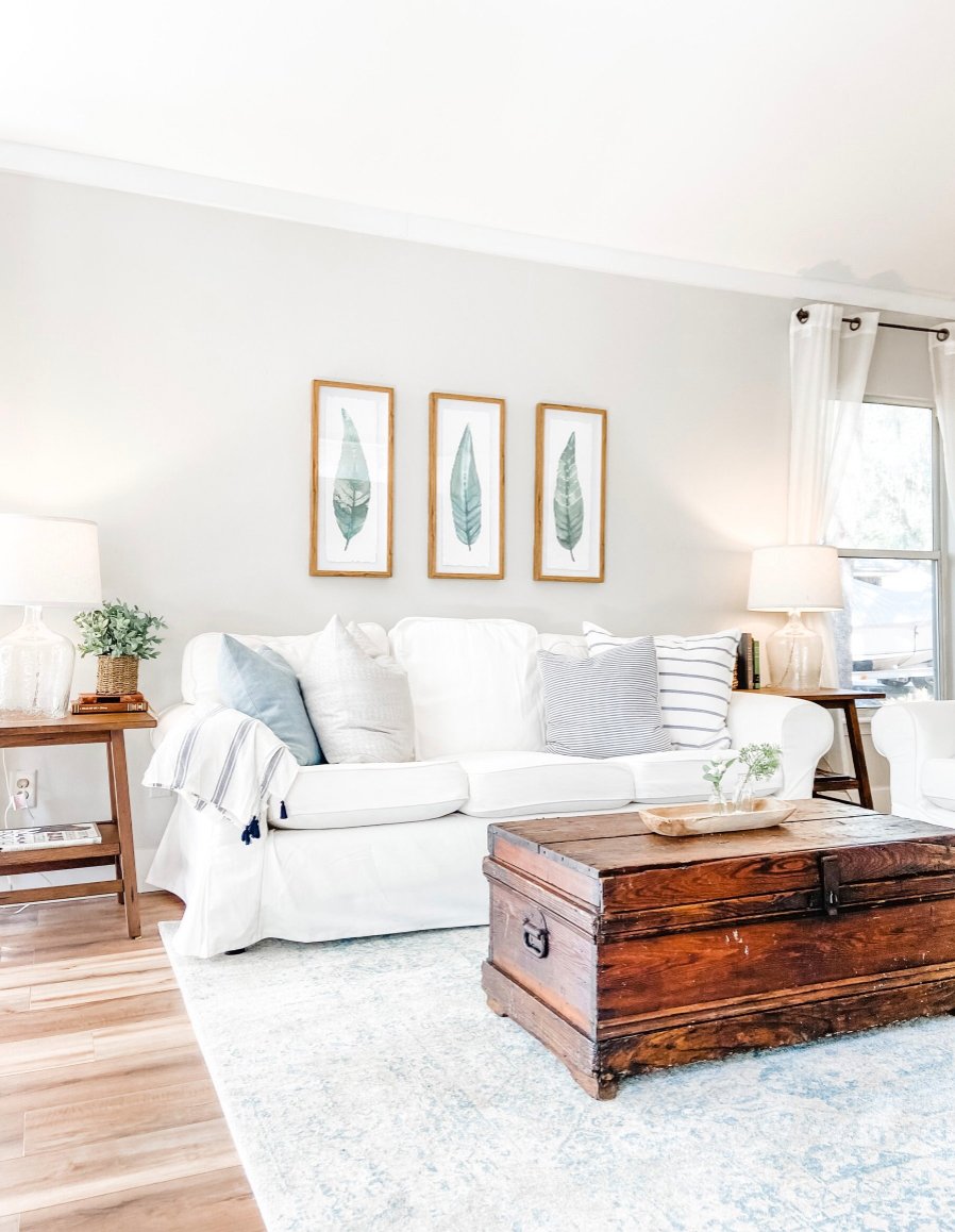
However, it's one of those funny paint colors that can change color depending on the light - sometimes it leans more gray, and sometimes it looks quite beige.
Agreebable Gray is a popular great choice for a living rooms and kitchens, and as a whole-house color.
Wind's Breath by Benjamin Moore
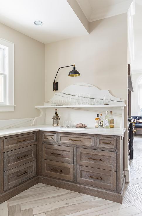
I first saw Wind's Breath in my friend's bedroom and instantly fell in love with its warmth and softness. Paired with white trim, it's the fresh modern version of a traditional beige.
Classic Gray by Benjamin Moore
Classic Gray has been gaining in popularity recently. I would consider this paint color to be the quintessential greige. It's a perfect mix of beige with just the right amount of gray undertones to stop it being too warm.
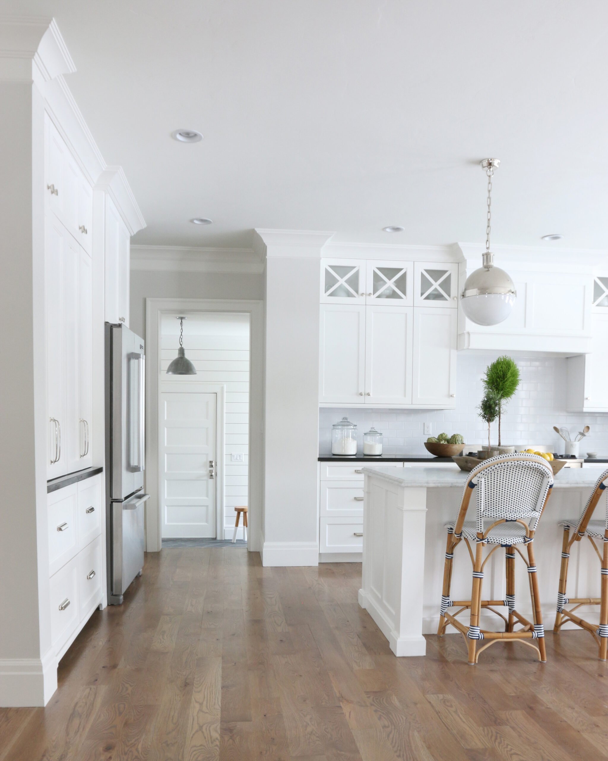
It will look grayer in darker corners but in a room with a lot of light it is beautifully soft and bright, and adds the right amount of warmth. It is a true warm neutral. If you like Repose Gray but want a bit more warmth, then I think Classic Gray will be perfect for you.
Balboa Mist by Benjamin Moore
Balboa Mist is a light warm gray paint color, that just about falls into the greige category.
In north facing rooms, or hiding in the shadows, it can look a bit grayer. While in brighter, warmer spaces with lots of sunlight it will look more beige.
Accessible Beige by Sherwin Williams
Accessible Beige is one of Sherwin Williams' top paint colors, and for good reason. It's an excellent choice if you're looking for a neutral that has a bit more saturation and warmth, while still having that slight gray base to tone it down.
White As a Neutral
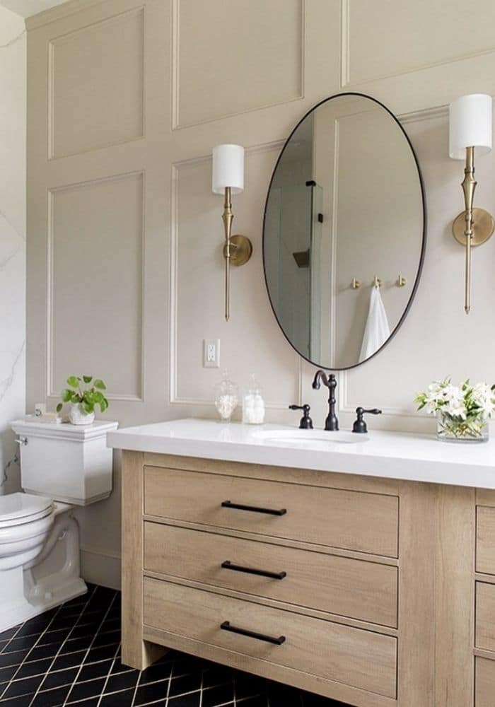
Warm white colors as well as shades of cream are another great choice when you're trying to achieve a neutral look in your home. The right white paint color (or cream) will look warm, soothing and play well with modern decor styles too - especially if paired with clean lines and finishes like warm wood furniture.
Popular Shades of White, Off-White and Cream
Drift of Mist by Sherwin Williams
I discovered this paint color when choosing between colors for my recent kitchen remodel.
It is very similar in tone to Repose Gray lightened by 50%, making it a wonderful light and airy color.
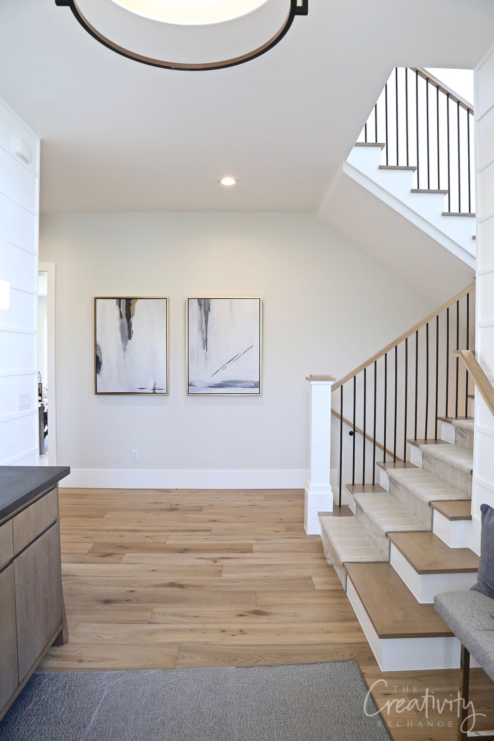
However, in certain light, it has a distinct green cast. For this reason, I think it would be better suited on am individual room basis, and not as a whole house color.
Paper White by Benjamin Moore
Paper White is another go-to paint color of mine. It's a very very soft gray, but technically falls into the "off-white" category.
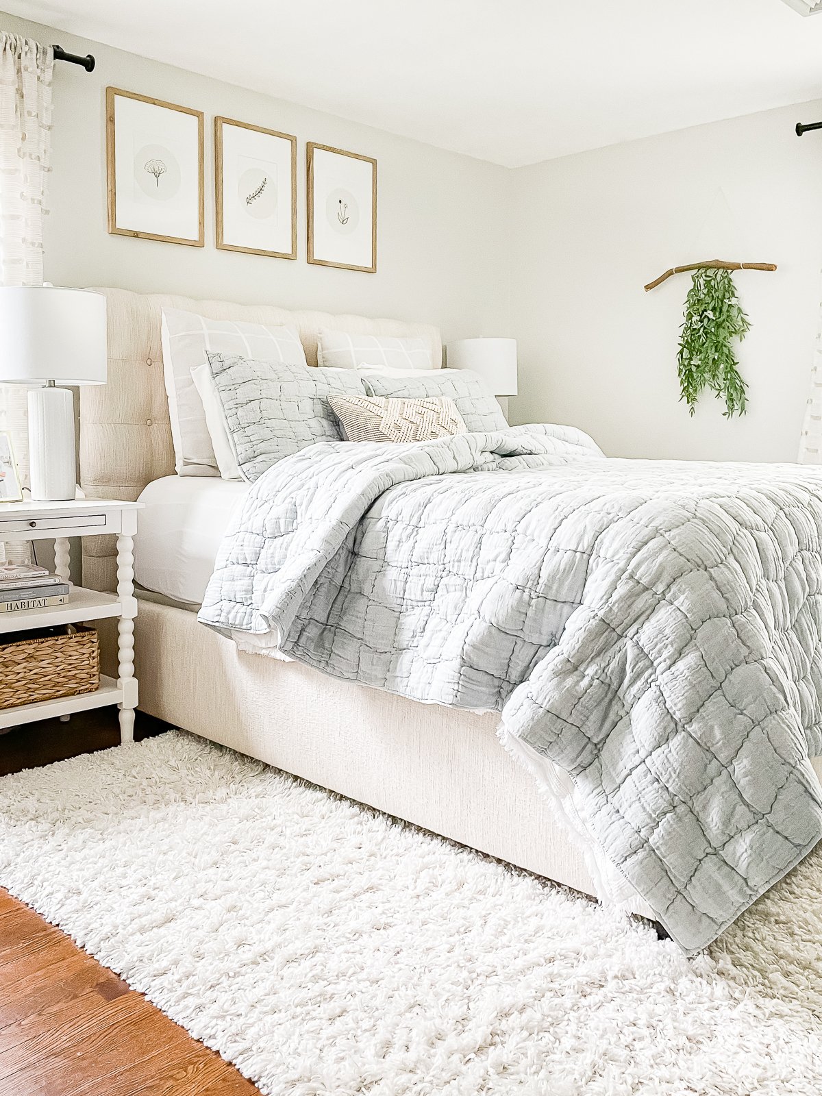
It has just enough green in it to stop it from ever feeling cold. In fact, it's my number one choice for east and west facing rooms that can feel cold and dark at one end of the day and warm and sunny at the other end.
It balances out really well for both lighting conditions to create the perfect neutral backdrop.
Simply White by Benjamin Moore
A highly popular shade of white, Simply White was actually Benjamin Moore's Color of The Year back in 2016.
It's still as popular as it was that year, and makes a great choice for a warm, creamy white for walls and trim.
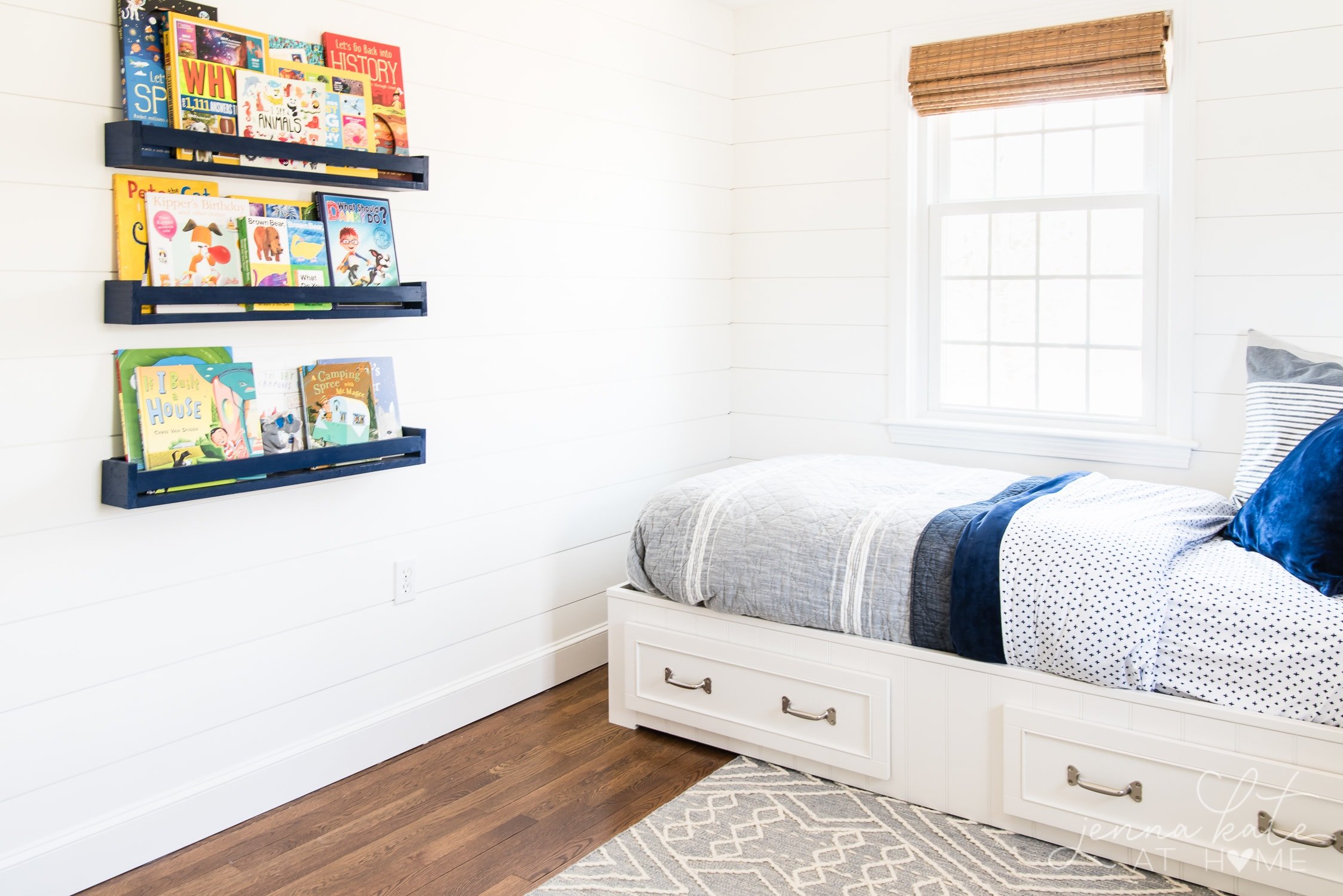
The one caveat with this color is that it can skew quite yellow, so opt for a higher sheen on the walls (I don't recommend this color in a matte finish, which is what we painted the boys' shiplap with).
It should be fine during the daytime, but incandescent light may bring out that yellow. In which case, consider switching your bulbs to a cooler daylight variety to combat those yellow undertones.
Alabaster by Sherwin Williams
Alabaster is a soft, creamy white. It verges almost on the territory of being off-white, but is just light enough to still be considered white.
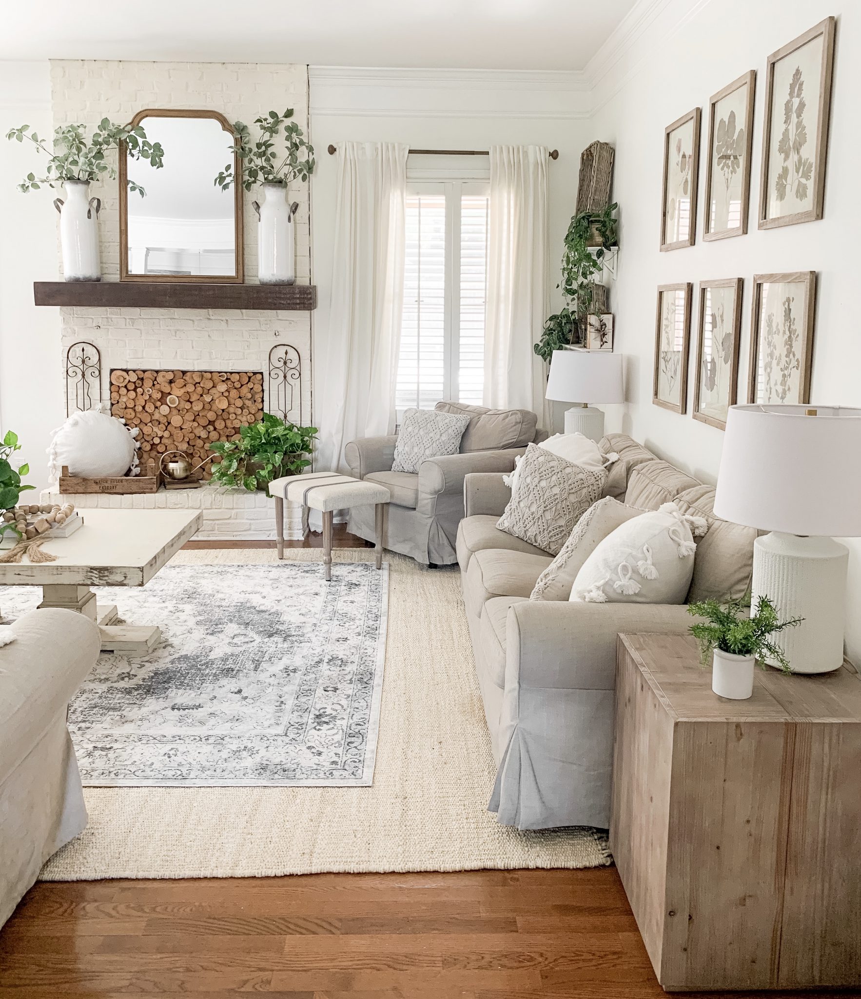
If you are looking for a warmer white that doesn't have any of the starkness or coldness or other whites, this may be the perfect choice for you!
White Dove by Benjamin Moore
White Dove is a soft, warm white. It feels warm and creamy but never comes across yellow.
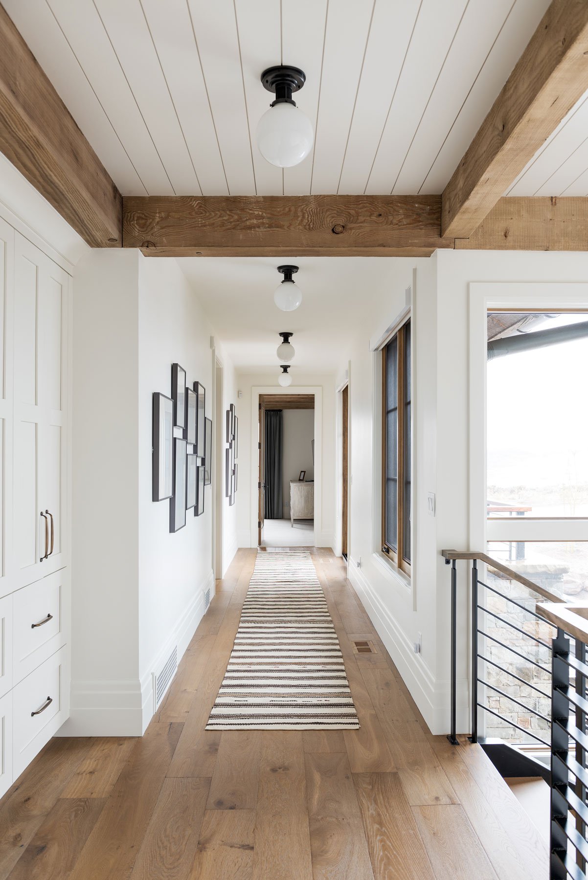
In bright light, it looks almost like a clean white but with just a hint of softness. White Dove is a popular choice for trim but also makes a beautiful neutral paint color for walls.
Creamy by Sherwin Williams
Creamy is a stunning cream paint color. It will add a warm, cozy, and inviting feel in your space. It helps make your space look fresh, welcoming, and bright at all times.
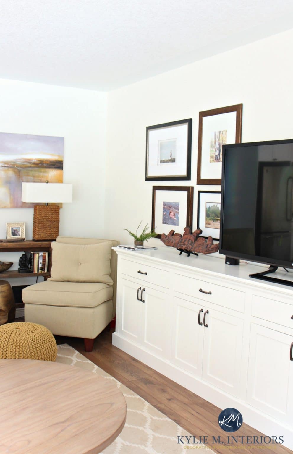
If you're looking for a light, fresh and well,creamy, neutral...this is the right choice for you!
Another beautiful creamy paint color. Similarly to Simply White, artificial light will bring out more of the yellow tones. But don't let that scare you off!
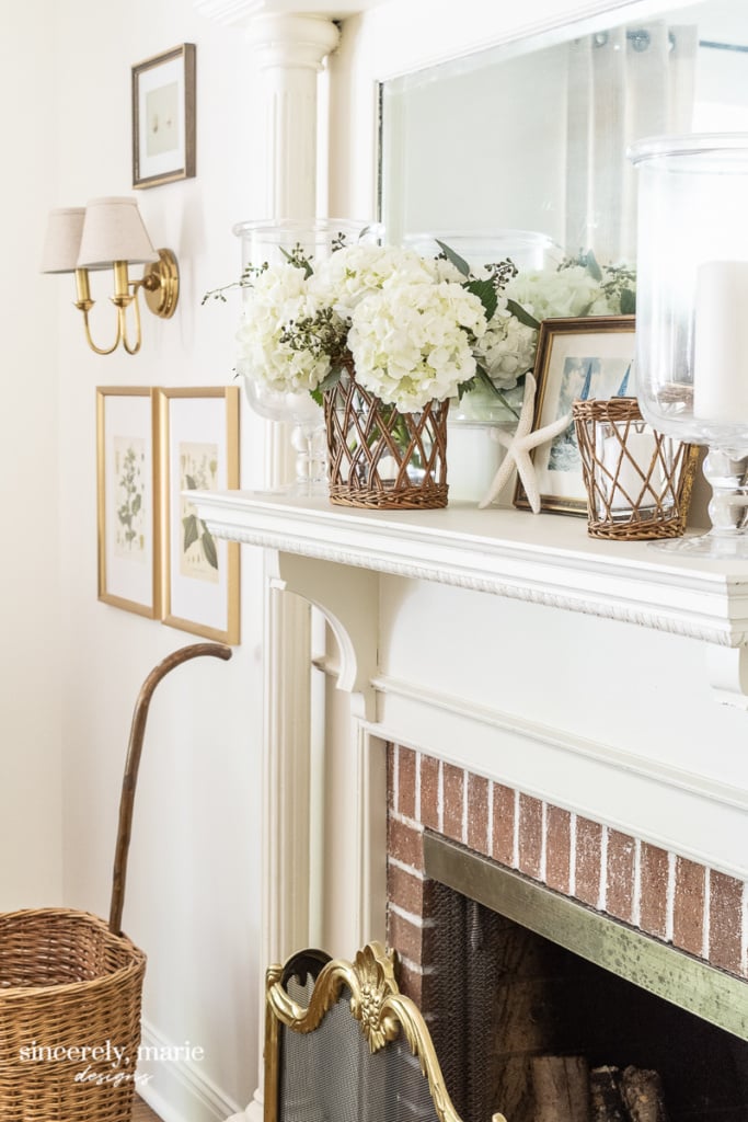
This is a wonderful warm white paint color that can serve as the perfect neutral backdrop for an entire home. It works particularly well in a more traditional home, filled with warm wood tones.
A Traditional Beige or Tan Neutral
Beige and tan make an excellent addition to these two classic shades because they offer richness that lighter neutrals may lack while still being easy on the eyes! Plus, these colors can be found in so many different varieties of taupes, browns and even shades that are closer to blonde.
Manchester Tan by Benjamin Moore
Beige is having a moment again in 2021, and I'm happy to see this popular color from the last decade making a resurgence.
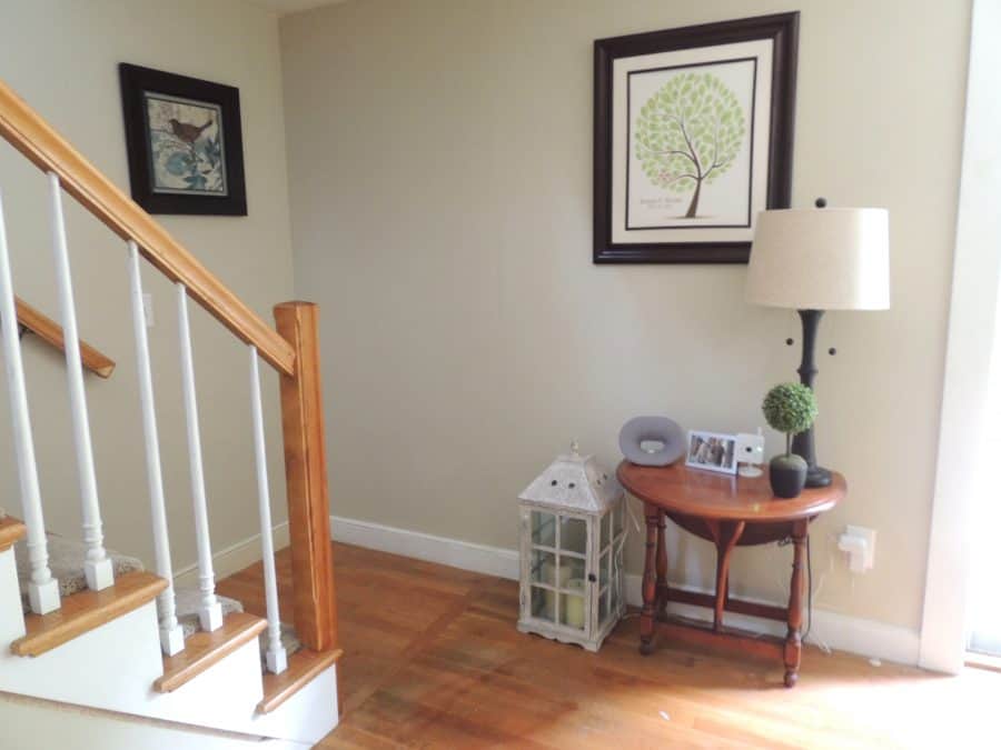
Manchester Tan works wonderfully alongside warm wood tones and honey oak. But equally works with bright white trim to clean a warm vibe for any room in your house.
Bleeker Beige by Benjamin Moore
Benjamin Moore's Bleeker Beige is the perfect beige that holds true in sunlight and is subtle and highly adaptable. It can be considered a taupey beige, but it does have just a smidge of gray that stops it from being overly warm.
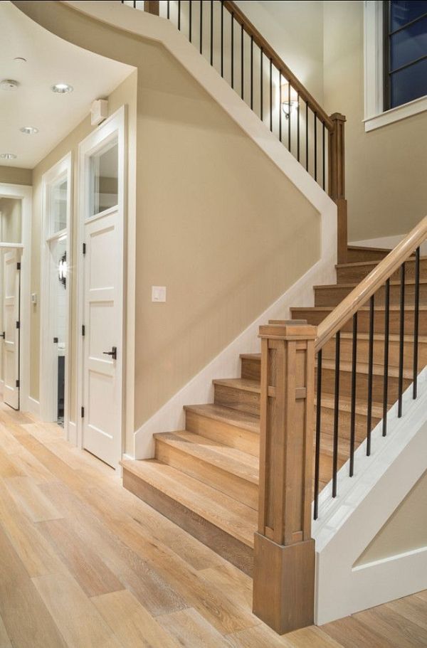
Bleeker Beige is a great choice if you have a lot of dark wood furniture and white trim. It's a great neutral that works particularly well in a modern traditional style home, but I've seen it work equally well in coastal-style homes paired with lots of navy blue!
Think Outside of The Box
A "neutral" paint color does not have to mean gray, greige, white or beige. In fact, any soft hue of a color can be used as a neutral.
While you may not want your whole house color scheme to be pastel pink, that may serve as a neutral in a little girl's room. Similarly, a soft blue-gray paint color would be a stunning neutral for a bedroom or bathroom.
Final Thoughts
I hope this paint guide has given you some ideas and inspiration as you find the perfect neutral paint color for your home this year.
And remember, don't let trends dictate how you decorate your home. At the end of the day, your home should be an expression of your personality and unique style! Don't be afraid to think outside the box and do what feels right for you and your home!
More Paint Colors To Consider
-
11 Beautiful Kitchen Cabinet Paint Colors
-
10 Of The Best Kitchen Island Colors
-
Best Living Room Paint Colors 2021
-
The Best Green Paint Colors
If you would like to follow along on more of my home decor, DIY and recipe posts, I'd love to have you follow me on any of the following:
Pinterest | Instagram | Facebook |
Source: https://jennakateathome.com/best-neutral-paint-colors/
